

Instructional Design Examples: 10 Real eLearning Designs, Annotated
Inspect ten published learning designs, from courses and games to an app and an archived scenario. See the design choices and ideas to adapt for your own training.

An instructional design example lets you inspect how a learning experience or documented design connects its objectives, explanation, practice and evidence. This collection includes courses, games, videos, an app and a scenario write-up.
- Judge an example by its practice, not its polish: the strong ones give learners something to decide or do early and often.
- The decisions worth copying: early practice, practice in the real tool, recoverable scenarios, role reversal, real stories, drawn video, spaced review and a real final exam.
- A job aid can support a task without requiring every detail to be memorised. Teach and practise using it where people need help interpreting the steps.

Go from storyboard to an interactive course in minutes
You want to see how a good course handles the hard part: where learners practise, and how they prove they can do the task. A description of a technique can't show you that. Opening a real course can.
A published learning experience or design write-up lets you inspect the choices behind it: what the learner is meant to do, what support they receive and how learning is checked. The format alone does not tell you whether those choices fit the task.
I'm Travis, cofounder of Coursebox, which makes instructional design software for training teams. Before that, I was project manager and lead learning designer on three University of Adelaide courses for edX. Below are ten published examples: courses, games, videos, an app and one archived scenario write-up. Access conditions vary. I explain the design choice I'd borrow for a small module, then show what our course agent built from the same brief.
What is an instructional design example?
Here, an example is a published learning experience or documented design you can inspect for its objectives, explanation, practice and assessment. Some are playable; others show their decisions through public lesson pages or a designer's write-up. A hypothetical storyboard can also be a useful design example, but this collection focuses on real published work.
Instructional design is the work of planning those decisions so people can do something they couldn't do before. eLearning is one way of delivering the result: a course people take on a screen, usually at their own pace. So every eLearning course is an instructional design example, good or bad, but a printed checklist or a workshop plan can be one too.
Models such as ADDIE and SAM describe the process a designer follows. Examples show you the product. If you want a model that works outwards from the task, read our guide to Merrill's principles of instruction. For teaching strategies in the abstract, see our list of instructional strategies.
How I read each example: lesson, practice, assessment
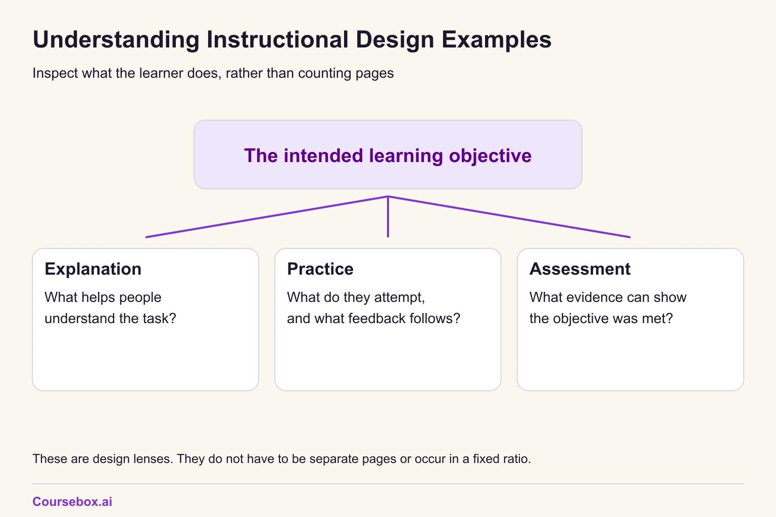
I use three lenses when reading a course: what it explains, what learners practise and how learning is assessed. They need not occupy separate pages. An explanation can include practice, and one assessment can also teach through feedback. Look at the quality and purpose of the activity rather than the number of page types.
There is evidence behind the bias towards practice. In a meta-analysis of 225 studies of undergraduate science, engineering and maths teaching, Scott Freeman and colleagues found that students in traditional lecture classes were 1.5 times more likely to fail than students in classes with active learning. That is university STEM, not workplace training, but it points the same way as the courses I build.
The running example: a phishing module for an accounting firm
To make each example useful, I read it against one small module. This module is hypothetical, written for this article.
- The learners: staff at a hypothetical 200-person accounting firm. They need to apply a short reporting policy to the email they receive. The business, policy and learning target below are invented for this design example.
- The source: a short IT security policy with five clauses. Report suspicious email with the Report Phish button, and don't forward or delete it first. Verify any change to a client's or supplier's bank details on the phone number held in the practice management system (the firm's client and billing software), then get approval from two partners. Sign in only at login.microsoftonline.com. Expect fake Australian Taxation Office (ATO) and myGov emails from July to October. If you clicked something, report it and call IT on extension 400; nobody is disciplined for reporting.
- The objective: given five emails, classify three intended phishing messages and two intended legitimate messages using the fictional reporting policy. Four of five is the illustrative course-check threshold, not proof that a person can safely handle every real message. Correct errors with feedback and check consequential actions separately.
- The time: 20 minutes.
Each example below uses the same four labels:
- What it is: the course, who made it and what the learner does.
- The design decision: the one choice that makes it work.
- Why it works: the reason, with evidence where there is some.
- Steal this for the phishing module: one idea I'd build into the module.
10 real instructional design examples (eLearning you can inspect)
The links lead to public course pages, exercises, apps or descriptions. Some learner activities require an account or enrolment. The Flash-based Haji Kamal scenario can no longer be played, so its designer's write-up is the evidence here.
Microlearning: Microsoft Learn's "Introduction to Git"
- What it is: A free beginner module, Introduction to Git on Microsoft Learn, with six short units: Introduction, What is version control?, Exercise: Try out Git, Basic Git commands, Module assessment and Summary.
- The design decision: The exercise comes third, straight after the first concept unit, instead of being saved for the end.
- Why it works: Learners use the idea while it is fresh, and the later assessment checks something they have already done. To pass, you have to answer every assessment question correctly.
- Steal this for the phishing module: After the first lesson, a practice page with two emails to sort before any more content.
For more short-format courses, see our microlearning examples.
Practice in the real tool: GitHub Skills "Introduction to GitHub"
- What it is: Introduction to GitHub, an exercise its README says takes less than one hour, with four tasks: create a branch, commit a file, open a pull request and merge it.
- The design decision: You copy the exercise into your own account and do every task in GitHub itself, not in a simulation of it.
- Why it works: There is almost no lesson. The practice is the course, and it happens where the skill will be used.
- Steal this for the phishing module: Practice pages that show an inbox laid out like the firm's own Outlook, with the Report Phish button where staff will find it.
Scenario-based learning: Cathy Moore's "Connect with Haji Kamal"
- What it is: A branching scenario built with Kinection for the US Army. It opens with "You're a US Army sergeant in Afghanistan" and asks you to make a good first connection with Haji Kamal. It was made in Flash in 2010, and Cathy Moore's write-up of the scenario says it can no longer be played.
- The design decision: The paths cross, so one bad choice doesn't doom you to a bad ending.
- Why it works: Learners see the consequence of a choice and can recover later in the same story, as they could in a real conversation. It was also set as homework before an in-class discussion, so the scenario fed a conversation instead of replacing it.
- Steal this for the phishing module: In a bank-details scenario, a learner who nearly approves the change gets a second chance when the second partner asks whether the call was made.
For how to build one, see our guides to scenario-based learning and branching scenario examples.
Role reversal: Shady Sam
- What it is: Shady Sam, a short browser game that opens on "your first day of work at Shady Sam's". You get three loans to choose from and are told to offer the one that will make the most money.
- The design decision: You play the lender, not the borrower.
- Why it works: To win, you have to think like the person exploiting the borrower, and the traps are easier to see from that side of the desk.
- Steal this for the phishing module: The learner plays the scammer and picks which of three emails would fool a busy accountant.
Our list of role play and simulation examples has more ways to put learners on the other side.
Story-based simulation: the FT's "Uber Game"
- What it is: The Uber Game from the Financial Times, which it describes as "a news game based on interviews with dozens of Uber drivers". You drive for seven days, with fares and ride totals on screen.
- The design decision: The choices come from those interviews, not from a writer's imagination.
- Why it works: A story built from reporting gives learners dilemmas they can't dismiss as made up, and the seven days let the pressure build.
- Steal this for the phishing module: Emails based on phishing the firm's IT team has actually received, such as the fake ATO emails that arrive between July and October.
Instructional video and screencasting: Khan Academy
- What it is: Khan Academy videos, where a narrator explains while a pen draws on a digital tablet.
- The design decision: The explanation is drawn as the narrator talks, instead of filmed as a lecture.
- Why it works: A large study of edX video data found tablet drawings like these were more engaging, and shorter videos more engaging still.
- Steal this for the phishing module: One three-minute screen recording that circles the warning signs on a real phishing email as the narrator talks: the sender's domain, the link address and the deadline.
The study, by Philip Guo and colleagues, used data from edX, the platform my own courses ran on. The researchers measured how long people watched and whether they tried the problems after each video, so this is evidence about attention, not about what people learnt. That is why the steal above is a three-minute video, not a ten-minute one. Our step-by-step guide to microlearning videos covers the production side.
Spaced repetition: Duolingo
- What it is: Duolingo, the language app, which schedules review based on how likely you are to have forgotten each word.
- The design decision: Practice comes back after a gap, and the gap is set for each learner.
- Why it works: A review of 839 assessments of spaced practice by Nicholas Cepeda and colleagues found that the best gap between study sessions grows with how long you need to remember. Duolingo's own researchers, Burr Settles and Brendan Meeder, reported that their spacing model raised daily engagement by 12% in a live test. That measured whether people came back, not how much they learnt.
- Steal this for the phishing module: A two-email recheck about a month after the course, and another in late June, before the fake tax emails start.
Compliance with a final exam: FEMA IS-100.c
- What it is: IS-100.c, Introduction to the Incident Command System, a public course from the US Federal Emergency Management Agency. It takes two hours, opens with the objectives you should meet by the end and finishes with a final exam you take online.
- The design decision: The course overview states the objectives up front, and the course ends in an exam rather than a completion click.
- Why it works: Learners know what they will be asked to do before they start. Tests also help people remember: in Henry Roediger and Jeffrey Karpicke's experiments, students who were tested on prose passages remembered more on a test days later than students who restudied them.
- Steal this for the phishing module: Write the five-email assessment first, from the objective, then build only the pages that lead to it.
A MOOC for non-experts: Elements of AI
- What it is: Elements of AI, a free online course (a MOOC, or massive open online course) created by MinnaLearn and the University of Helsinki. Its first part needs no complicated maths or programming, and the course reports over 2 million sign-ups and graduates in more than 170 countries.
- The design decision: No prerequisites. Theory is mixed with exercises, and learners go at their own pace.
- Why it works: Removing the maths and programming barrier opens a technical subject to people who would otherwise never start it.
- Steal this for the phishing module: Write for the receptionist and the partner at once: no jargon, and terms like "spoofed domain" explained in the sentence where they appear.
A course I designed: AdelaideX "Managing Addiction" on edX
- What it is: Managing Addiction: A Framework for Successful Treatment, a self-paced University of Adelaide course on recognising addiction and matching people with alcohol and other drug problems to treatment. It first ran in 2015, and on 29 October 2026 edX still listed it as open for enrolment. I was its project manager and lead learning designer.
- The design decision: I can't credit the result to one decision, and I won't pretend to. A MOOC's retention depends on who enrols and why as much as on its design.
- What happened: It produced some of the highest retention rates recorded on edX at the time.
- Steal this for the phishing module: Look at where learners stop. Twenty thousand learners went through another course I designed, Think.Create.Code., and at that scale you stop guessing what works and start seeing it. In the phishing module, I'd check which page people leave on before changing anything else.
What the ten examples have in common
The "where the time goes" column is my reading of each course, not a measurement.
| Example | Format | Where the time goes | Decision to copy |
|---|---|---|---|
| Introduction to Git | Microlearning module | Lesson, practice and assessment in balance | Practice in the middle, not the end |
| Introduction to GitHub | Hands-on exercise | Almost all practice | Practise in the real tool |
| Connect with Haji Kamal | Branching scenario | Practice, followed by class discussion | Paths cross back after a bad choice |
| Shady Sam | Game | Mostly practice | Play the other side |
| The Uber Game | Story-based simulation | Mostly practice | Build the story from real interviews |
| Khan Academy | Instructional video | Mostly lesson | Draw the explanation as you talk |
| Duolingo | Spaced practice app | Mostly practice | Bring practice back after a gap |
| FEMA IS-100.c | Compliance course | Mostly lesson, then a final exam | State the objectives, end in an exam |
| Elements of AI | MOOC | Theory mixed with exercises | No prerequisites |
| Managing Addiction | MOOC | Not judged here, as it is my own course | Watch where learners stop |
Three patterns run through the strongest of them:
- Practice is visible in several formats: an exercise inside GitHub, choices in a scenario and repeated language questions. A short page may contain more useful practice than several longer ones, so inspect what learners actually do and the feedback they receive.
- Assessment is part of the learning. Microsoft and FEMA both ask real questions before a learner is done, and Roediger and Karpicke's results suggest that being tested helps people remember, not only shows what they know.
- Duolingo makes planned review visible. That is one design to borrow when later recall is needed; other examples may also contain repeated practice, so this collection does not establish that only one uses spacing.
A one-page Word sheet for reading any example the same way: what it is, the design decision, where the learner's time goes and what you would steal for your own course. It has the phishing module filled in as the course, Shady Sam as a worked row and four blank rows. It is a planning aid with no score, and no email is required.
When the right example is not a course: the WHO Surgical Safety Checklist
Some of the best instructional design never becomes a course. The WHO Surgical Safety Checklist is a 19-item job aid that a surgical team works through at three pauses: before anaesthesia, before the first incision and before the patient leaves the operating room. Nobody is expected to memorise it. The design is the card, and the pauses at which the team uses it.

Case study: A surgical checklist tested in eight hospitals
Surgical complications are common and often preventable. Between October 2007 and September 2008, eight hospitals in eight cities, from Toronto and Seattle to New Delhi, Manila and Ifakara in Tanzania, took part in the World Health Organization's Safe Surgery Saves Lives programme.
- What they did: The hospitals introduced the 19-item checklist, designed to improve team communication and consistency of care. Researchers collected outcomes for 3,733 patients aged 16 and over having non-cardiac surgery before the checklist, and 3,955 after it.
- Evidence and result: In the study led by Alex Haynes and published in the New England Journal of Medicine, the death rate fell from 1.5% to 0.8%, and inpatient complications fell from 11.0% to 7.0%.
- Limitation: It was a before-and-after comparison with no control group, and the authors report that the checklist was associated with the fall, not that it caused it. Each hospital ran a programme to introduce the checklist, so the result belongs to that programme, not to a printed card alone.
- Lesson: The checklist and its introduction programme supported a task performed under pressure. A job aid can keep key checks available during work, while training and team practice help people use it correctly. The study does not isolate the effect of the card from the surrounding programme.
The rule I use: consider a job aid when reliable steps can be kept close to the task, then teach or practise its use where people need help interpreting it. A course and a card can work together. The phishing module needs practice deciding what to report as well as access to the current policy. Our action mapping guide develops that choice.
Build your own: the phishing module from the ten examples
Here is the 20-minute module assembled from the "steal this" lines. It has seven pages: two lessons, three practice pages, one assessment and one summary.
- Lesson: when in doubt, report. The five policy clauses in plain words, with "spoofed domain" explained where it appears (Elements of AI).
- Practice: sort two emails. One phishing email and one legitimate email in an inbox laid out like the firm's Outlook, with the Report Phish button (Microsoft Learn, GitHub Skills).
- Lesson: the warning signs. The three-minute screen recording that circles the sender, the link and the deadline on a fake ATO email (Khan Academy, the Uber Game).
- Practice: play the scammer. The learner picks which of three emails would fool a busy accountant, then sees why (Shady Sam).
- Practice: the bank-details request. A branching scenario where a supplier asks to change their bank details, with a way back if the learner nearly approves it (Haji Kamal).
- Assessment: the five-email challenge. Three phishing emails and two legitimate ones, shown as real emails, with 4 of 5 needed to pass. Written before the other pages (FEMA IS-100.c).
- Summary: what to do next time. The Report Phish button, extension 400 and the date of the first recheck (Duolingo).
After launch, check which page people leave on (Managing Addiction). If you'd rather start from a blank plan, our course outline template has the structure.
Notes from testing: building the module in Coursebox
I wanted to see whether our course agent would build a practice-heavy module or a content-heavy one from the same policy and objective, so I built it in a test workspace.
What I asked for. I pasted the five policy clauses into the prompt and asked for "a 20-minute phishing-awareness module for staff at a 200-person accounting firm". I gave it the objective above, worded slightly differently, and asked for "lessons, practice and an assessment, with one scenario where the learner plays the scammer." The agent accepts uploaded files, but my policy was written for the test, so I pasted it.
What it produced. It asked no clarifying questions and went straight to a plan of four pages, about 20 minutes: two lessons ("When in doubt: report" and "Spot the requests that need a pause"), one practice page and a "Five-email challenge" assessment. My plan has three practice pages; the agent's has one. Lessons outnumber practice two to one, but each lesson ends with an apply-it question, not a definition question. The lessons followed the policy closely, including extension 400, "You will not be disciplined for reporting" and bank changes verified "through the approved number in the practice management system, then obtain approval from two partners". I found no policy detail to correct. The practice page was a three-turn choice scenario, "Diverting a Supplier Payment", in which the learner plays the scammer. Its first question asks which tactic "would be most likely to make the employee trust the request before checking it carefully?" The assessment had five Report Phish or Leave items, three phishing and two legitimate, with an 80% pass mark. Every item asked for a decision on an email, not a recall question like "What is phishing?". That part was right first time.
What was wrong. The agent's hand-over note said "all ten requested requirements were verified as met", but the assessment emails were described to the learner rather than shown, and the descriptions gave the answer away. One item said the email "explicitly tells you to skip the usual approval from two partners". Another said its link "opens microsoft-login.example.net, not the firm's only sign-in domain". A learner could score 5 out of 5 by reading the narrator's hints, so the assessment did not test the objective. The planned workflow diagram was also missing, because "no AI image credits remained". And there was no spaced follow-up: the course ends at the assessment. I didn't ask for one, and nothing in the agent offered to schedule a recheck, so that has to be set up outside the course.
The fix, and how I checked it. I asked the AI editor to show each email itself, with From, Subject, body and full link addresses, removing narrator hints while keeping five items and the three/two mix. After reloading the quiz editor, I read every item. Each was now an email rather than a narrator's description. The intended answer labels were still phishing for 1, 3 and 5 and legitimate for 2 and 4. That verified a content change, not the assessment's validity: item 4 had lost the context needed to judge it, as described below.
Two problems remain. Each email renders as one bold paragraph, not a formatted message. And item 4, the legitimate invoice, lost the line telling the learner they were expecting it, so a careful learner could reasonably report it. I'd add that line by hand before using the module. Even then, the course shows only how staff sort five emails on a screen. Whether they report real phishing is something only the firm's own reports can show.
Where to find more instructional design examples
Public course catalogues, designers' portfolios and community galleries provide different kinds of examples. Microsoft Learn publishes free module content; GitHub Skills uses a GitHub account, and other providers may require registration or charge for certificates. Our guide to instructional design portfolios covers how to read and build one. Check the current access terms before recommending an example to your team.
Putting the examples to work
Use an example to identify a design choice you can examine against your own task. Look at what learners do and the support and feedback they receive, alongside how clearly the experience is presented.
Pick a course your team runs and use the teardown sheet to connect its objective with the explanation, practice, feedback and assessment. If a required decision is only described, add a chance to make it. If later recall is important, plan a recheck. Evaluate those choices against the task rather than requiring practice pages to outnumber lesson pages.
Frequently Asked Questions
It is a learning experience or documented design you can inspect for its objectives, learner activities, support and assessment. A course, game, workshop plan, job aid or designer's write-up can provide an example.
Ten to look at: Microsoft Learn's Introduction to Git, GitHub Skills' Introduction to GitHub, Cathy Moore's Haji Kamal scenario (as a write-up), Shady Sam, the FT's Uber Game, Khan Academy videos, Duolingo, FEMA IS-100.c, Elements of AI and AdelaideX's Managing Addiction on edX.
Microsoft Learn publishes free module content, while GitHub Skills uses a GitHub account for its exercises. Other providers may require registration or offer paid certificates. Check the current access terms; this collection includes public write-ups and videos as well as activities.
Practice and assessment tied to one thing the learner has to do at work. Strong courses give learners decisions to make early and often, use questions that help people remember as well as test them, and bring practice back after a gap.
Instructional design is the process of deciding what learners read, practise and are assessed on. eLearning is one way of delivering the result, on a screen. A workshop or a printed checklist can be instructional design without being eLearning.
Travis Clapp
Travis Clapp is the original founder and CEO of Coursebox. As an experienced instructional designer, he has lived through the process of building high quality courses. These experiences brought about his idea to upload all your documents and ideas into a virtual box that could convert those magically into a course. Prior to Coursebox, he successfully founded and built a social based LMS. Travis has 15+ years of experience designing courses and EdTech platforms from university MOOCs to enterprise LMS. Travis has built training for reputable companies like Johnson & Johnson, Electrolux, Michael Hill and SA Health. One of his courses reached 20,000+ learners which was a flagship edX course. He is based in the Adelaide, South Australia office and passionately works on customer support, sales and bringing the original product vision to life every day.

