

Cognitive Theory of Multimedia Learning: Mayer's Principles
Mayer's cognitive theory of multimedia learning explained: three assumptions, all 15 principles with effect sizes, when they help and two free templates.

The cognitive theory of multimedia learning is Richard Mayer's explanation of how people learn from words and pictures, based on three assumptions: people have separate verbal and visual channels, each channel holds little at once, and learning needs active processing.
- Mayer's list of design principles grew from 7 in 2001 to 12 in 2009 and 15 in the 2021 edition of his book.
- Three of Mayer's 15 principles find that a popular add-on does not reliably help, such as the speaker's face on screen or virtual reality.
- The redundancy principle warns against printing the narration on screen beside a narrated graphic, mainly in fast-paced lessons.
- Mayer's principles help most for novices, complex material and lessons that play straight through, and can get in experienced learners' way.
- In a sample of 112 course requests typed into Coursebox, up to 57 asked for short segments and no more than 7 asked for narration.
Five planning prompts for one course. This is an unvalidated checklist. Inspect each answer separately; the total cannot establish alignment, readiness or effectiveness.

Go from storyboard to an interactive course in minutes
Picture a new laboratory technician in their first week, clicking through a narrated slide deck about the lab's benchtop centrifuge. The narrator reads out a paragraph that is also printed on the screen, a stock photo of a smiling scientist fills half the slide, background music plays under the voice, and the one diagram that shows where the tubes go sits on a different slide from the words that explain it. The technician finishes the video and still loads the rotor unbalanced.
I'm an instructional designer at Coursebox, where we make instructional design software that turns a designer's brief into a course outline with pages, images, video and scenarios, so how words and pictures share a screen is part of my job. Richard Mayer's cognitive theory of multimedia learning explains what went wrong in that video, and his principles say how to fix it. I walk through the theory, the 15 principles with the evidence behind each one, when they help most, and the same centrifuge course designed with them.
What is the cognitive theory of multimedia learning?
The cognitive theory of multimedia learning is Richard Mayer's explanation of how people learn from words and pictures, based on three assumptions: people have separate verbal and visual channels, each channel holds little at once, and learning needs active processing.
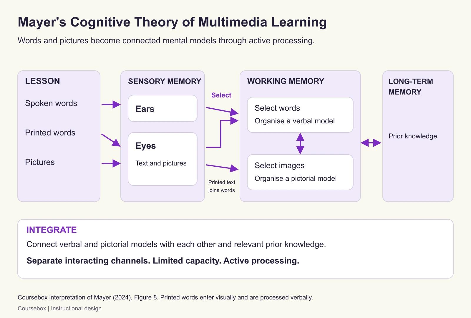
The theory applies to what Mayer calls a multimedia instructional message: "instructional material consisting of words (e.g., printed text or spoken text) and graphics (e.g., illustrations, photos, animation, video, or immersive virtual reality) intended to foster new knowledge or skills in a learner". That definition comes from Mayer's 2024 review of the theory's past, present and future, the current statement of the theory by its originator, free to read. A slide deck with a voiceover, an explainer video, an e-learning page with a diagram and a printed manual with illustrations all count. Mayer's aim is to explain how people learn "academic material" from these, measured by transfer tests, which ask people to use what they learnt in new situations.
The three assumptions, in Mayer's words (2024, p. 17):
- Dual channels: "humans have separate but interacting channels for processing auditory/verbal information and pictorial/visual information".
- Limited capacity: "humans can process only a few pieces of information in each channel at one time".
- Active processing: "meaningful learning occurs when the learner engages in appropriate cognitive processing during learning", which means selecting what to attend to, organising it, and connecting it with prior knowledge.
Mayer's model puts these into three memory stores and five processes. Words and pictures enter through the ears and eyes into sensory memory. The learner selects some of the words and some of the images for working memory, organises the words into a verbal model and the images into a pictorial model, and then integrates the two with each other and with prior knowledge from long-term memory. One detail explains a lot of bad slide design: printed words come in through the eyes, so on-screen text competes with the picture for the same visual channel, even though it is verbal.
Because working memory is limited, Mayer describes three demands on it during a lesson (2024, p. 18):
- Extraneous processing serves no instructional goal and comes from poor design, such as irrelevant pictures or words.
- Essential processing is the work of representing the material itself, and it rises with how complex the material is for that learner.
- Generative processing is the effort to make sense of the material, and it depends on how motivated the learner is.
Each demand gives a design goal: minimise extraneous processing, manage essential processing and foster generative processing. Every principle serves one of the three. They are design checks that apply together, not a sequence of stages.
The 15 principles at a glance
The table adapts Mayer's own summary of the 15 principles from the third edition of his book Multimedia Learning (2021), as published in Table 6 of his 2024 review under a CC BY 4.0 licence. The effect sizes are medians across the experiments run in Mayer's lab, in Cohen's d. By Cohen's rule of thumb, 0.2 is a small effect, 0.5 a medium one and 0.8 a large one. The Tests column shows the number of experimental comparisons behind each median. I keep Mayer's US spelling for the principle names and use Australian spelling everywhere else.
| Goal | Principle | What it says, in plain words | Effect size (2021) | Tests |
|---|---|---|---|---|
| Reduce extraneous processing | Coherence | Cut material that does not serve the goal | 0.86 | 19 |
| Reduce extraneous processing | Signaling | Add cues that highlight how the essential material is organised | 0.69 | 16 |
| Reduce extraneous processing | Redundancy | Do not add printed text that repeats the narration of a narrated graphic, when the lesson is fast-paced | 0.10 | 12 |
| Reduce extraneous processing | Spatial contiguity | Place words near the parts of the picture they describe | 0.82 | 9 |
| Reduce extraneous processing | Temporal contiguity | Present words and the matching pictures at the same time | 1.31 | 8 |
| Manage essential processing | Segmenting | Break a lesson into segments the learner paces | 0.67 | 7 |
| Manage essential processing | Pretraining | Teach the names and characteristics of the main concepts first | 0.78 | 10 |
| Manage essential processing | Modality | Explain a graphic with narration rather than on-screen text | 1.00 | 19 |
| Foster generative processing | Multimedia | Use words and pictures rather than words alone | 1.35 | 13 |
| Foster generative processing | Personalization | Write the words in a conversational style | 1.00 | 15 |
| Foster generative processing | Voice | Narrate in a friendly human voice rather than a machine voice | 0.74 | 7 |
| Foster generative processing | Image | Adding the speaker's image does not reliably help | 0.20 | 7 |
| Foster generative processing | Embodiment | If an instructor is on screen, use gesture, movement and eye contact | 0.58 | 17 |
| Foster generative processing | Immersion | 3D virtual reality does not reliably beat the same lesson on a desktop | -0.10 | 9 |
| Foster generative processing | Generative activity | Guide learners to summarise, explain or test themselves during learning | 0.71 | 44 |

Case study: Pharmacists' compliance training in Houston
Training in current good manufacturing practice (cGMP) is federally mandated in the United States for people who work in pharmaceutical manufacturing, and the standard version is text-heavy regulatory content. Researchers at the University of Houston College of Pharmacy redesigned a cGMP training video and tested it with pharmacists in the Houston area.
- What they did: They applied Mayer's principles together with cognitive load theory and other presentation design changes. On-screen text was cut to key points, about 90% less than the standard video, the explanation moved into narration, key regulatory points were picked out with contrasting colour and underlining, and slides used full-bleed photographs.
- Evidence and result: In a randomised crossover study published in 2026, 49 pharmacists each watched one standard and one redesigned video in random order and were tested straight after each. The redesigned version scored 78% against 72% on the knowledge assessment (p = 0.04), and self-rated mental effort fell from 3.5 to 2.4.
- Limitation: The two videos covered different regulatory subparts, so the topic and the design cannot be fully separated. The redesign also added background music to the intro and outro, which the coherence principle advises against. Every measure was taken immediately, and nobody checked compliance on the job.
- Lesson: A redesign that cut printed text to key points, moved the explanation into narration and cued the key points, alongside other changes, came with a modest immediate gain and a large drop in felt effort. It is a cheap first pass on slide-heavy compliance videos, to be followed by a check on what people remember later.
Who developed the theory, and how many principles are there?
Richard Mayer developed the theory with his colleagues from experiments that began in 1989. He started with what became the multimedia principle, that people learn better from words and pictures than from words alone, and built the theory around the results. Mayer credits the ideas he built on. Dual channels come from Allan Paivio's dual coding theory and Alan Baddeley's model of working memory. Limited capacity draws on George Miller, Baddeley and John Sweller, whose cognitive load theory Mayer describes as a competing theory he borrowed from. Active processing reflects Merlin Wittrock's work on generative learning. Mayer sets out these debts in his 2024 review.
The name took a while to settle. Mayer's own history lists a "model of meaningful learning", a "dual-coding model" and the select, organise and integrate model, then the name "cognitive theory of multimedia learning" in papers from 1996 to 2000. The standard diagram dates from the first edition of Multimedia Learning in 2001, and the theory has its own chapter in each edition of The Cambridge Handbook of Multimedia Learning (2005, 2014 and 2022). Mayer is also one of the authors of the 2001 revision of Bloom's taxonomy.
The number of principles depends on which edition you read. Mayer's own counts, from Tables 3 and 4 of the 2024 review:
| Edition of Multimedia Learning | Principles | Experimental comparisons | What changed |
|---|---|---|---|
| 1st edition, 2001 | 7 | 45 | Multimedia, spatial contiguity, temporal contiguity, coherence, modality, redundancy and individual differences |
| 2nd edition, 2009 | 12 | 93 | Added signaling, segmenting, pretraining, personalization, voice and image; individual differences no longer a separate principle |
| 3rd edition, 2021 | 15 | 201 | Added embodiment, immersion and generative activity |
"Mayer's 12 principles", the list most often quoted, comes from the 2009 second edition: multimedia, coherence, signaling, redundancy, spatial contiguity, temporal contiguity, segmenting, pretraining, modality, personalization, voice and image. It is a real list, but no longer the current one. Embodiment belongs to the 2021 edition, not the 2009 twelve. Other counts circulate too: Mayer's 2008 article in American Psychologist summarised 10 principles, a 2017 journal review of his has a different 12 that includes embodiment and leaves out image, and the 2022 handbook covers 31 principles from many research groups. When you see a list, check which source it came from.
Which of Mayer's works to read
- Start with Mayer's open-access 2024 review for the theory, the fifteen principles and the scope of their evidence.
- For workplace e-learning, read Ruth Colvin Clark and Richard Mayer's e-Learning and the Science of Instruction, fifth edition (2024). It applies the principles to training design.
- For the full evidence and the boundary conditions of each principle, read Multimedia Learning, third edition (2021), from Cambridge University Press.
The worked example: a centrifuge safety course
To show the principles in use, I carry one hypothetical course through the rest of this guide, the course from the opening scene. A laboratory is onboarding new technicians, and they must learn to use its benchtop centrifuge safely. Some have science degrees and some work in a second language, but none has used this model, and none has been trained on its alarm. The procedure has six parts: load the tubes, balance them, start a run, stop it, unload, and respond to an imbalance alarm. Learners get the lab's written procedure and the manufacturer's manual, and the course must prepare them for a supervised first run on the bench. The intended outcome is that each technician can load a balanced rotor, start and stop a run safely and respond correctly to the alarm, judged by a supervisor watching them at the bench.
The existing training is a narrated slide deck built from the manual: full paragraphs on screen read aloud, a decorative photo on most slides, and the rotor diagram on a different slide from the steps that use it. A centrifuge course makes most principles visible, because it has named parts to learn, steps in a fixed order, diagrams that need labels and a timed response to an alarm. It is also a stretch for the theory, which Mayer tested mainly on explanations of how systems work, such as lightning, brakes and pumps. Procedures and physical skills are an extrapolation, and the bench is where they get tested.
Reducing extraneous processing: five principles
These five principles remove work that does not help learning, so the learner has more capacity left for the material itself.
Coherence principle
People learn better when extraneous material is excluded rather than included. Extraneous material means interesting but irrelevant words, pictures, sounds and music. Coherence does not mean "present the material clearly", which is closer to signaling.
- What it says: Cut whatever does not serve the instructional goal.
- Evidence and limits: A median effect of 0.86 across 19 tests. Mayer's 2009 summary says coherence may help most for learners with low working-memory capacity or low knowledge of the topic.
- In the centrifuge course: Cut the history of the manufacturer, the background music and the stock photos. Keep only what a technician needs to load, run, stop and respond.
Signaling principle
People learn better when cues are added that highlight the organisation of the essential material.
- What it says: Show learners what to look at and how the parts fit together, with headings, an outline, arrows or highlights.
- Evidence and limits: A median of 0.69 across 16 tests, up from 0.52 on 6 tests in 2008.
- In the centrifuge course: Open with a one-screen overview of the six parts, keep the same heading on every screen of a part, and highlight the lid lock and the opposite tube positions as the narration names them.
Redundancy principle
People do not learn better when printed text is added to graphics and narration, at least when the lesson is fast-paced. It is often read as a ban on putting words with pictures, which it is not.
- What it says: When a graphic is already explained by narration, do not print the same narration on screen as well.
- Evidence and limits: A median of only 0.10 across 12 tests, and the 2021 wording limits it to fast-paced lessons. In their 2003 paper, Mayer and Moreno reported the reverse when no animation was shown: narration plus matching on-screen text helped. A 2012 meta-analysis of 57 studies by Adesope and Nesbit found spoken and written words together helped learners with low prior knowledge, in system-paced material and in materials without pictures.
- In the centrifuge course: In the narrated animation of a run, keep the screen to the animation plus short labels such as "rotor" and "lid lock". Put the full text in a transcript or a summary page, not on top of the animation.
The principle does not say "use graphics or text, never both" or "never repeat information". Words placed near a picture are the spatial contiguity principle, and words with pictures are the multimedia principle. In Mayer and Moreno's 2003 paper the redundancy effect is defined "in a more restricted sense than Sweller", as cutting "an unneeded duplication of essential material": the narration repeated in print over a narrated animation. Short on-screen text placed next to the part it names can still help.
Spatial contiguity principle
People learn better when corresponding words and pictures are presented near rather than far from each other on the page or screen.
- What it says: Put each label on the part it names, and each explanation next to the step it describes.
- Evidence and limits: A median of 0.82 across 9 tests in Mayer's lab. An independent meta-analysis of 58 comparisons by Schroeder and Cenkci, with 2,426 participants, found g = 0.63 for integrated designs, which is smaller but still clear.
- In the centrifuge course: Label the rotor, buckets, lid lock and alarm light on the diagram itself, not in a legend under it. Show feedback on a quiz question beside the question, not on a later screen.
Temporal contiguity principle
People learn better when corresponding words and pictures are presented simultaneously rather than successively.
- What it says: Say each step while the picture shows it, not before or after.
- Evidence and limits: The largest median of the extraneous group, 1.31 across 8 tests. Mayer's 2009 summary says it may apply less when a lesson alternates short segments or when the learner controls the pace.
- In the centrifuge course: The narration says "close the lid until the lock clicks" while the animation shows the lid closing, not as a summary at the end of the clip.
Managing essential processing: three principles
Some material is complex for a newcomer however well it is designed. These three principles spread that load so it does not overwhelm working memory.
Segmenting principle
People learn better when a multimedia lesson is presented in user-paced segments rather than as a continuous unit.
- What it says: Break the lesson into meaningful segments and let the learner decide when to move on.
- Evidence and limits: A median of 0.67 across 7 tests. The active ingredient is learner control of the pace. Mayer gives no rule for segment length, so "keep videos under ten minutes" is a different claim. His 2009 summary says segmenting is most likely to help when the material is complex, the presentation is fast-paced and the learner is inexperienced.
- In the centrifuge course: One short segment per screen, each ending with a Continue button. The same idea underlies most microlearning videos.

Case study: Nutrition educators across 18 US states and territories
The Expanded Food and Nutrition Education Program (EFNEP) in the United States employs paraprofessional educators who teach nutrition to low-income families. They are spread across many states, have mixed levels of education, and had no standard training: it varied from state to state.
- What they did: A Colorado State University researcher built an online course on prenatal nutrition from forty short video clips, using the multimedia, modality, coherence, segmenting and personalization principles together with a broader instructional design model and role-play videos. The narrator spoke in a conversational style, and the design left out decorative background music.
- Evidence and result: In a 2016 doctoral study, 139 educators from 18 states and territories were assigned by state to the course or to a waitlist, and 131 were analysed (67 and 64). After the course, 92% of the trained group reached mastery on the knowledge test against 65% of the waitlist, and 95% against 75% on a scenario test that asked educators to spot poor teaching practice in videos.
- Limitation: The comparison group had no training at all, so the study shows the course worked, not that Mayer's principles caused the gain. Teaching performance was not observed, self-efficacy was self-reported, and the tests had low internal consistency.
- Lesson: For a dispersed, part-time workforce, a short-clip online course brought most staff to mastery where untrained peers mostly did not. Check judgement with scenario items, not recall alone.
Pretraining principle
People learn better from a multimedia lesson when they know the names and characteristics of the main concepts. Pretraining is a design move, not a statement that learners must already know the basics.
- What it says: Teach the parts and terms before the lesson that shows how they work together.
- Evidence and limits: A median of 0.78 across 10 tests.
- In the centrifuge course: A "Meet the centrifuge" page comes first, with a labelled diagram naming the rotor, the buckets or tube holders, the lid lock, the control panel and the imbalance alarm, so the procedure can refer to them without stopping to explain.
Modality principle
People learn better from graphics and narration than from graphics and on-screen text. Modality and redundancy are different rules. Modality compares narration with printed text beside a graphic. Redundancy asks whether to add printed text on top of narration.
- What it says: When a graphic needs explaining, say the explanation instead of printing it.
- Evidence and limits: A median of 1.00 across 19 tests, and in 2008 Mayer wrote that it "has the most support of any of the principles we have investigated". Outside his lab the effect is smaller, and in a classroom study by Harskamp and colleagues, reported by de Jong, it disappeared for learners who took their own time. Mayer's 2009 summary adds that printed words may suit lessons with technical terms and symbols, and learners who are non-native speakers.
- In the centrifuge course: Narrate the animation of a run, and keep technical terms such as the speed setting in print beside the control panel, where staff working in a second language can read them.
The modality principle applies to all learners. It says nothing about "auditory learners" or "visual learners". In his 2008 American Psychologist article, Mayer rejected the argument that printed text lets "people who prefer to read" read while others listen. His own lab tested the verbal versus visual learner idea: Pashler and colleagues' 2008 review reports that Massa and Mayer "found no support" for matching instruction to preferences across nearly 20 individual-difference measures. The wider evidence on learning styles points the same way.
Fostering generative processing: seven principles
These seven principles encourage the learner to put in the effort to make sense of the material.
Multimedia principle
People learn better from words and pictures than from words alone.
- What it says: Add a relevant picture to the words. A decorative picture fails the coherence principle instead.
- Evidence and limits: The largest median of all 15, 1.35 across 13 tests. Mayer's 2009 summary says it may apply more strongly to learners with low prior knowledge, who need help connecting words and pictures.
- In the centrifuge course: A diagram of the rotor showing four tubes in opposite positions, next to the words that explain balance.
Personalization principle
People learn better from multimedia lessons when words are in conversational style rather than formal style.
- What it says: Address the learner as "you" and write the way a colleague would explain it.
- Evidence and limits: A median of 1.00 across 15 tests. Mayer's summaries say it may work best for beginners and when it is not overdone, and may not apply to long lessons. A 2024 randomised trial with pharmacists, physicians and advanced practice providers added personalisation and embodiment to a 30-minute module, and knowledge did not differ (Cohen's d 0.02), although learners noticed the features.
- In the centrifuge course: "Place your second tube directly opposite the first" rather than "Tubes shall be positioned in opposing positions".
Voice principle
People learn better when the narration is spoken in a friendly human voice rather than a machine voice.
- What it says: Narrate with a friendly human voice rather than a machine voice.
- Evidence and limits: A median of 0.74 across 7 tests, and it was listed as preliminary research in 2009. The sources I read do not test today's AI voices, so the principle cannot settle whether a given synthetic voice is good enough.
- In the centrifuge course: Play the narration to one or two technicians before launch and replace any voice they find hard to follow.
Image principle
People do not necessarily learn better from a multimedia lesson when the speaker's image is added to the screen.
- What it says: A talking head does not reliably help learning. It is not a ban either.
- Evidence and limits: A median of 0.20 across 7 tests. Mayer's 2014 handbook chapter reported 14 tests, half with negative or negligible effects.
- In the centrifuge course: Keep the screen on the centrifuge during the procedure rather than on the trainer's face.
Embodiment principle
People learn more deeply when an on-screen instructor displays high embodiment, meaning gestures, movement and eye contact, rather than low embodiment. It is new in the 2021 edition.
- What it says: If an instructor appears on screen, they should point to and look at what the learner needs to see.
- Evidence and limits: A median of 0.58 across 17 tests. It describes how an instructor appears on screen, not whether one should, and the 2024 trial with health professionals found no significant difference in knowledge when it was added alongside personalisation.
- In the centrifuge course: If the lab manager demonstrates the alarm response on camera, they point to the alarm light and the stop button as they name them.
Immersion principle
People do not necessarily learn better in 3D immersive virtual reality than with a corresponding 2D desktop presentation. It is new in the 2021 edition.
- What it says: Virtual reality does not by itself improve learning over the same lesson on a screen.
- Evidence and limits: A median of -0.10 across 9 tests, slightly in favour of the desktop version.
- In the centrifuge course: A desktop animation and a supervised run on the real centrifuge, with no headset.
Generative activity principle
People learn better when they are guided in carrying out generative learning activities during learning. It is new in the 2021 edition and has the most tests behind it.
- What it says: Ask learners to do something with the material, such as summarise it, explain it to themselves or test themselves.
- Evidence and limits: A median of 0.71 across 44 tests. Fiorella and Mayer (2016) describe eight activities: summarising, mapping, drawing, imagining, self-testing, self-explaining, teaching and enacting.
- In the centrifuge course: After the balance segment, learners choose where the fourth tube goes and say why. The alarm part ends with a short scenario in which they decide what to do and in what order. Ideas for interactive e-learning modules fit here.
In practice I look at one screen and ask four questions together: what on it could go (coherence), where the eye should land (signaling), whether the words sit next to the picture (spatial contiguity) and whether the narration is also printed (redundancy). One pass catches problems that a principle-by-principle read misses.
How strong is the evidence behind the principles?
The principles rest on more than 200 experiments, but many were short lessons run in Mayer's lab, and several effects shrink as more evidence comes in. Keep three points in mind before you put the numbers in front of stakeholders.
First, three of the 15 are findings that a popular add-on does not reliably help: printed text added to narrated graphics (0.10, and only for fast-paced lessons), the speaker's image (0.20) and virtual reality (-0.10).
Second, some effects have shrunk as the evidence grew.
The sources I read do not say why the redundancy effect dropped, so I would not guess. The modality effect shows the same pattern outside his lab. A 2012 reanalysis by Reinwein doubled the evidence base of an earlier meta-analysis by Ginns, which had found d = 0.72 across 43 effects.
Third, independent reviews still support the core of the theory. In a 2022 overview of reviews by Noetel and colleagues, the authors' summary reports 29 reviews covering 1,189 studies and 78,177 participants, with the largest benefits for temporal and spatial contiguity and signaling. The same summary says good design was more important for complex materials and in system-paced settings, such as lectures, than in self-paced ones.
Use the evidence to identify design changes to try, especially clearer relationships between labels, pictures and narration. Effect sizes summarise different experimental comparisons; they are not a ranked menu of interchangeable fixes or a prediction for your course. Check the relevant boundary conditions and test the redesign with your learners.
When do Mayer's principles help most?
In his 2024 review, Mayer writes that each principle has boundary conditions: "for whom the principle applies, for which kind of lesson the principle applies, and under what circumstances". Three conditions come up again and again.
- The learner is new to the topic. The first edition's individual differences principle said design effects are stronger for low-knowledge learners, who cannot fill gaps from what they already know.
- The material is complex for that learner. Segmenting and modality help most when there is a lot to hold in mind at once.
- The lesson plays at its own pace. A video that runs straight through, or a live webinar, leaves no time to reread or replay. When learners control the pace, the design effects in the studies are smaller.
The reverse also holds. In a 2003 paper, Kalyuga and colleagues named the expertise reversal effect: "Instructional techniques that are highly effective with inexperienced learners can lose their effectiveness and even have negative consequences when used with more experienced learners". In one of their examples, inexperienced electrical trainees needed text integrated into circuit diagrams, while experienced trainees did better with the diagram alone. Narration can also become redundant for experienced learners.
Here is how I read those conditions for the centrifuge course. The table is my synthesis of the sources, not Mayer's own advice.
| Situation | Principles to prioritise | What to ease off |
|---|---|---|
| New technicians, narrated video that plays straight through | Pretraining, segmenting, modality, spatial and temporal contiguity, signaling | Little; this is where design has the most effect |
| Experienced technicians, self-paced refresher | Coherence and generative activity | Full narration and step-by-step labels they no longer need |
| Lessons full of technical terms, or staff working in a second language | Spatial contiguity, with key terms printed beside the picture | Narration-only explanations of new terms |
| Learners who are deaf or hard of hearing | Captions and transcripts, plus spatial contiguity | The redundancy principle, which does not override accessibility |
Keep accurate synchronised captions available for prerecorded narrated video. A transcript is a useful companion, but does not replace synchronised captions. The redundancy principle concerns particular instructional comparisons and does not override access needs. Use short labels on the graphic, captions that learners can enable, and an appropriate text alternative for visual information.
How to use Mayer's principles to design or audit a lesson
Start from the learners and the delivery, then decide the structure, then check each screen. This is the order I work in:
- Find out what learners already know. Ask, test or look at their work, and do not assume knowledge from a job title. Prior knowledge decides how much the principles will help.
- Decide how the lesson will run. Note whether it plays straight through, as in a webinar or a video, or whether learners control the pace.
- Teach unfamiliar parts and terms before the lesson that relies on them, and use meaningful learner-paced segments where the delivery allows. Learners who already know the terms may not need a separate pretraining page.
- Plan each screen as a pair: what the picture shows and what the narration says. Keep printed words to labels and key terms placed next to what they name.
- Cut what does not serve the goal and cue what does. Remove decorative images, music and tangents, and add highlights or headings for what learners must notice.
- Add a generative activity between segments. A prediction, an explanation or a short scenario.
- Pilot, then check after a delay. Test what learners can do a few weeks later, not only at the end of the lesson.
The centrifuge course, screen by screen
| Screen | Before | Principle | After |
|---|---|---|---|
| Meet the centrifuge | No parts page; the manual's terms appear first in the procedure | Pretraining | A first page with a labelled diagram of the rotor, buckets, lid lock, control panel and alarm |
| Load and balance | A paragraph on balance and a separate photo of the rotor | Spatial contiguity and multimedia | One diagram with tubes in opposite positions, labels on the parts and the explanation beside it |
| Start a run | The narrator reads the full printed paragraph over the animation | Redundancy and modality | Narrated animation with short labels only; the full text moved to a summary page |
| Start a run | The lid closes in the animation before the narration mentions it | Temporal contiguity | The narration names each step as the animation shows it |
| Every screen | Stock photos and background music | Coherence | Removed |
| Stop and unload | One long narrated sequence that plays straight through | Segmenting | Two segments, each ending with a Continue button |
| Imbalance alarm | A slide listing what to do | Generative activity and signaling | A scenario where the learner decides the order of actions, with the alarm light highlighted |
Check a narrated lesson or video against Mayer's 15 principles, with the question to ask of each screen, the conditions under which each principle helps most, the centrifuge course audited as an example and blank audit pages to use. Editable Word file, no email required.
What do course requests ask for?
To see how people brief multimedia courses, we classified a sample of requests typed into Coursebox in the 90 days to 7 October 2026: one per person, from English-language browsers, with no uploaded file, and with pre-outline answers and template duplicates removed. A language model classified the 266 prompts that remained, of which 112 were course requests, and we spot-checked its examples by hand. It counted generously, so these are model-coded estimates, not audited upper bounds or estimates of all Coursebox users.
Up to half the course requests asked for content split into short modules or chunks, which is the structural half of segmenting.
about 28 asked for visuals, about 20 for less text and about 12 for video. Requests mentioned chunking much more often than narration. If you brief a course builder, say which explanations should be narrated over a graphic, what the on-screen text is for and what to leave out. Otherwise those decisions are made for you.
Mayer's theory vs cognitive load theory
Mayer's theory and John Sweller's cognitive load theory share the idea of a limited working memory, and Mayer borrowed from it, but they are separate theories with separate vocabularies. Cognitive load theory describes the load that material and design place on the learner. Mayer's theory describes the processing the learner does with words and pictures, and in the 2005 handbook he wrote that cognitive load theory "does not focus on the kinds of information processes involved in multimedia learning". The two define redundancy differently. Mayer's version is narrower, while in cognitive load theory any unnecessary repetition can be redundant. Mayer's own terms have also shifted: in his 2003 paper, "essential processing" meant something closer to making sense of the material. Use one theory's vocabulary per document.
| Feature | Mayer's cognitive theory of multimedia learning | Sweller's cognitive load theory |
|---|---|---|
| Main question | How do people learn from words and pictures together? | How does the load of material and design affect learning? |
| Unit of analysis | The learner's processing: selecting, organising and integrating | The load on working memory |
| Key terms | Extraneous, essential and generative processing | Intrinsic, extraneous and germane load |
| Redundancy means | Printed text that repeats the narration of a narrated graphic | Any information that is unnecessary for that learner |
| Best for | Designing slides, video, narration and e-learning screens | Deciding how much guidance, worked examples and practice learners need |
Limitations of the theory
The theory holds up well in the lab. The open questions are about long courses, real workplaces and the size of the effects.
- Most tests used very short lessons. In a 2010 critique of cognitive load research, Ton de Jong noted that two studies from Mayer's group used lessons of about 2.5 and 6 minutes, and that many participants in this research have no particular interest in the topic. In his 2024 review, Mayer himself calls for studies in "online courses, and professional training".
- The theory is about academic explanations. Mayer describes it as being about "academic material", and most tests used explanations of how systems work. Applying it to procedures, physical skills or attitudes, as in the centrifuge course, is an extrapolation.
- Effects shrink outside the originating lab. Reinwein's reanalysis found that the research group was one of the factors linked to the size of the modality effect.
- Immediate gains can fade. Most tests come straight after the lesson, and the one workplace study I found with a later test shows the gap closing.
- Workplace evidence is thin. I could not find a verified case of a private company outside health care that redesigned its e-learning with Mayer's principles and measured the result. The published workplace evidence sits mostly in health care and public programmes.
- There are competing accounts. Mayer names Wolfgang Schnotz's integrated model of text and picture comprehension as one.

Case study: Operating theatre nurses in Singapore
Perioperative nurses at Khoo Teck Puat Hospital's Day Surgery Centre in Singapore must learn a protocol for responding to complications during cataract surgery. The existing teaching slides were text-heavy, and more of the teaching had moved online.
- What they did: Researchers built e-lecture slides on the redundancy, spatial contiguity, modality, segmenting, multimedia, personalization and embodiment principles, with an animated on-screen agent, and compared them with point-form slides with minimal graphics. Both lectures ran for about 30 minutes.
- Evidence and result: In a 2025 preprint, 44 nurses were randomised 22 and 22. Straight after the lecture, the redesigned group scored a median of 6.00 against 4.75 on a six-question test (p = 0.02). Four weeks later the groups no longer differed significantly (4.50 against 3.75, p = 0.21).
- Limitation: It is a preprint and has not been peer reviewed. It is a small, single-site study, the test had only six questions, all the principles changed at once, and the reported baseline figures are inconsistent. Nobody observed nurses in theatre.
- Lesson: The redesigned group scored higher immediately, but the later comparison was inconclusive. A non-significant difference does not establish equal retention or equal forgetting. Plan spaced practice and a refresher for any protocol people must remember.
Using Mayer's principles with an AI course builder
On 7 October 2026 I briefed Coursebox for the centrifuge course: new laboratory technicians, the six parts of the procedure, and a design built on pretraining, segmenting, words and pictures together, coherence and signaling. It is our product, so weigh my read with that in mind.
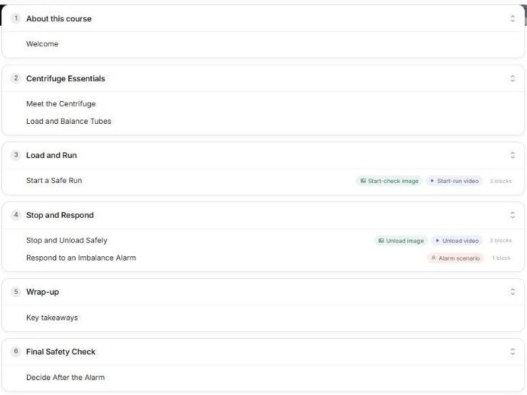
Most of the structure came back as I had asked. The procedure was split into short pages: Load and Balance Tubes, Start a Safe Run, and Stop and Unload Safely. Each of the two step pages had three blocks in the outline, including an image and a video. Start a Safe Run had a Start-check image and a Start-run video, and Stop and Unload Safely had an Unload image and an Unload video. The alarm response became a scenario, Respond to an Imbalance Alarm, and the outline ends with a Final Safety Check section holding Decide After the Alarm.
One thing went missing. After one of my revision requests, the outline no longer had the pretraining page, which names the parts before the procedure.
I asked for it back as Meet the Centrifuge, at the start of the Centrifuge Essentials section and before Load and Balance Tubes. When I reloaded the outline, Meet the Centrifuge sat first in Centrifuge Essentials. The final outline ran about 20 minutes across 6 sections and 8 pages, including an About this course welcome section and a Wrap-up section. That confirms the structure only. The outline shows no image block on Meet the Centrifuge yet, so check that a labelled diagram of the parts is added before learners use it. Whether the narration avoids repeating the on-screen text, and whether technicians can run the centrifuge safely, needs checking in the generated course and on the bench.
Plan each screen of a narrated lesson as a pair, with what the picture shows, what the narration says, the on-screen labels, the cue and the learner's action, with the centrifuge course filled in and blank pages to use. Editable Word file, no email required.
Putting Mayer's principles to work
Mayer's cognitive theory of multimedia learning explains why a lesson that piles printed narration, decoration and scattered labels onto a screen teaches less: words and pictures compete for a small working memory. The principles say which fixes to try, and three of them warn against add-ons that do not reliably help. They help most when learners are new, the material is complex and the lesson plays straight through, which describes a lot of onboarding and compliance training. For experienced staff on a self-paced refresher, expect smaller gains and strip back the support.
Take one narrated lesson you already run and audit a single screen. Check whether the narration is also printed over the graphic, whether every label sits on the part it names, and what on the screen could go. Fix those three, add a page that names the parts before the procedure, and test learners again a few weeks later, because a better first lesson does not replace practice.
Frequently Asked Questions
The cognitive theory of multimedia learning is Richard Mayer's explanation of how people learn from words and pictures, based on three assumptions: people have separate verbal and visual channels, each channel holds little at once, and learning needs active processing. From it come 15 evidence-based design principles in the 2021 edition of his book Multimedia Learning.
The 12 principles come from the 2009 second edition of Multimedia Learning: multimedia, coherence, signaling, redundancy, spatial contiguity, temporal contiguity, segmenting, pretraining, modality, personalization, voice and image. The 2021 third edition adds embodiment, immersion and generative activity, making 15.
Richard Mayer developed it with colleagues from experiments that began in 1989, and the name appears in his papers from 1996 to 2000. He built on Allan Paivio's dual coding theory, Alan Baddeley's work on working memory, John Sweller's cognitive load theory and Merlin Wittrock's generative learning.
The modality principle says a graphic is better explained by narration than by on-screen text. The redundancy principle says that once a graphic is narrated, printing the same narration on screen as well does not help, at least in fast-paced lessons. Short labels beside the graphic are fine under both.
Richard Mayer is known for the cognitive theory of multimedia learning and its design principles, for Multimedia Learning and The Cambridge Handbook of Multimedia Learning, and for e-Learning and the Science of Instruction with Ruth Colvin Clark. He is also one of the co-authors of the 2001 revision of Bloom's taxonomy.
Carolina Martin
Carolina is a highly experienced learning designer with tech start-up experience. She is based in Sydney and previously designed courses alongside Coursebox founder Travis in a previous job. She is passionate about delivering engaging learning experiences and brings the same perspective to customer experience too. She manages our customer support documentation and product testing processes.

